Case Study: How a Virtual Garden Designer Turned Pinterest Planting Plans Into Paid Site Reviews
A composite teardown of a virtual garden designer who replaced broad inspiration Pins with intent-led routes to paid site reviews, email guidance, and full design plans.
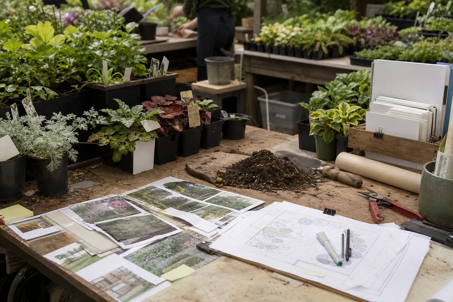
A beautiful border can earn hundreds of saves and still produce no work for a garden designer.
That was the central problem for this composite virtual garden design business. Its Pinterest account had plenty of lush before-and-after imagery, but the people clicking through were arriving with an unresolved question: Will this work in my yard?
The business did not need more inspiration traffic. It needed a practical bridge between a homeowner’s early planting research and a paid design decision.
This teardown shows how the business used Pinterest planting-plan searches to sell a small paid site review first, then create a more natural path to full garden plans.
A note on the case: This is a composite built from recurring operator patterns, not a report of one client’s results. The figures below are illustrative operating numbers, not benchmarks or promises.
The business and its original problem
The consultant sold virtual garden design for homeowners with small front yards and side yards. Her offers were simple:
- A free PDF: 12 Reliable Plants for a Low-Maintenance Border
- A $89 virtual site review: photo markup, a basic planting direction, and a short recorded walkthrough
- A $595 custom planting plan with a scaled layout, plant list, and implementation notes
Her Pinterest profile primarily sent people to a homepage or the free PDF. Pins were visually strong but broad:
- Small front yard landscaping ideas
- Cottage garden inspiration
- Pollinator garden ideas
- Low-maintenance garden ideas
Those phrases can attract relevant people, but the destinations asked every visitor to take the same next step: join an email list for a general plant list.
The baseline: activity without buying intent
In the four weeks before the rebuild, the account’s numbers looked healthy at a glance:
| Signal | Four-week baseline | What it actually indicated |
|---|---|---|
| Impressions | 14,800 | Plenty of discovery |
| Saves | 590 | Strong visual appeal |
| Outbound clicks | 116 | Limited action relative to saves |
| PDF signups | 25 | General gardening interest |
| Paid site reviews | 0 | No clear bridge to a paid decision |
| Full-plan deposits attributed to Pinterest | 0 | Revenue was invisible or absent |
The freebie was not inherently bad. It was simply too broad for the next offer.
Someone searching for a full-sun front-yard planting plan was closer to a purchase than someone browsing cottage garden inspiration. Treating both people as identical created a leaky funnel.
The first decision: organize Pins by the decision being made
Rather than create more Pins for the same homepage, the consultant sorted existing and future content into three visitor states.
1. Homeowners ready to get help now
These people searched for a usable plan, a site-specific answer, or a design decision:
- front yard planting plan for full sun
- narrow side yard landscaping plan
- low-maintenance front garden layout
- foundation planting ideas for shade
They did not need to download a generic plant list before learning about the paid review.
These Pins went directly to a page for the $89 site review. The page showed a marked-up example photo, listed exactly what the buyer received, stated the turnaround time, and explained what the service did not cover.
The key Pin message became specific:
“Not sure what will work in your sunny front bed? Get a photo-based planting direction before you buy plants.”
That is different from promising a complete landscape plan in a Pin. It names the smaller problem the buyer can solve immediately.
2. Homeowners who knew the problem but not the conditions
This group searched questions such as:
- plants for dry shade
- how much sun does my front yard get
- clay soil garden ideas
- how to plan a pollinator border
They needed help diagnosing their site before a paid review would make sense.
For them, the free PDF became a better-fit lead magnet: a Yard Conditions Worksheet. It asked readers to record sun exposure, bed dimensions, drainage, existing plants, maintenance tolerance, and local climate conditions.
A generic plant list made the consultant look knowledgeable. The worksheet made the reader understand why a tailored recommendation has value.
3. Homeowners browsing for visual direction
Broad searches still had a place, but they were no longer treated as direct-response traffic.
Pins around cottage garden style, layered front borders, and welcoming entry gardens led to an article with photo examples and a clear next step: identify the yard conditions before choosing a style. From there, readers could download the worksheet or book a paid review.
This structure respected Pinterest search intent instead of forcing every visitor into the same email funnel.
The offer change that made the funnel work
The $89 site review became the bridge offer.
Before the rebuild, the jump was too large:
Pinterest inspiration → free PDF → $595 custom plan
After the rebuild, it became:
Problem-specific Pin → matched page → $89 site review → custom plan when needed
The lower-priced review was not a discounted version of the full plan. It had a constrained, easy-to-explain outcome:
- One outdoor area
- Up to three homeowner photos
- A short intake form covering conditions and priorities
- A marked-up image or basic concept direction
- A recommended next step: DIY implementation, a plant-shopping list, or a full plan
That scope protected the consultant’s time. It also made the paid offer credible for a visitor who had only just discovered the brand through Pinterest.
Why this is a better conversion step than a consultation call
An open-ended consultation call asks a cold visitor to commit time without knowing what they will get. A defined site review answers three silent questions:
- Is this designer right for my type of yard?
- Can I get help without buying a large plan immediately?
- What happens after I upload my photos?
For service businesses with visual expertise, a narrow paid diagnostic can do more than a free discovery call. It attracts people willing to make a decision, while giving the operator an opportunity to identify full-project fit.
Rebuilding the Pinterest destinations
The consultant made three landing pages instead of one catch-all page. Each page repeated the language of the Pin that sent the visitor there.
| Pin theme | Landing-page headline | Primary action |
|---|---|---|
| Full-sun front yard planting plan | Get direction for your sunny front bed before plant shopping | Buy a site review |
| Dry-shade plant questions | Find the conditions that shape a dry-shade planting plan | Download the worksheet |
| Cottage-style front garden ideas | Choose a garden style that fits your light, space, and upkeep preference | Read the guide, then choose a next step |
The visual continuity mattered. If the Pin featured a narrow, sunny front bed with loose perennial planting, the page opened with that same kind of project—not a generic services banner.
Each page included:
- A concise explanation of the problem it solves
- One clear action, rather than three equal buttons
- A realistic example of the deliverable
- Starting price and turnaround expectation
- A note about service boundaries, including that local plant suitability depends on conditions
- A short FAQ addressing photos, measurements, and virtual delivery
This is a useful rule for Pinterest landing pages: a visitor should be able to see, in five seconds, that they landed in the right place.
The email sequence stopped selling too early
The worksheet subscribers received five emails over nine days. The goal was not to manufacture urgency; it was to move readers from vague preferences to a real project decision.
Email 1: Return the worksheet and set expectations
The first email delivered the download and showed how to estimate sun exposure across a day. It asked subscribers to keep their answers nearby.
Email 2: Explain why style is not a planting plan
This message used two example yards with a similar cottage-garden look but different light and moisture conditions. It explained why copying a saved image can produce disappointing results.
Email 3: Show the site review deliverable
Instead of a generic sales pitch, the email showed a redacted example: homeowner photo, annotated concerns, a suggested layout direction, and a list of decisions the homeowner could now make.
Email 4: Offer a self-serve alternative
Not every subscriber needed design help. This email pointed readers to a free article on measuring a planting bed and a curated supply list. That preserved trust and reduced unsubscribes from DIY-oriented readers.
Email 5: Invite the next decision
The final email asked a direct question: “Do you need a second opinion on one bed, or a complete plan for the area?” It linked separately to the paid site review and full-plan inquiry page.
This split matters. The email list was no longer a holding pen between Pinterest and a sales pitch. It helped people choose the right level of help.
The Pin mix: fewer generic images, more decision-led creative
The consultant did not abandon polished garden images. She paired them with text and destinations that gave the image a job.
Here are five Pin concepts from the first publishing batch:
| Pin title | On-image angle | Destination |
|---|---|---|
| Front Yard Planting Plan for Full Sun | Plan your bed before buying plants | Paid site review page |
| Dry Shade Garden: Start With These 5 Site Checks | Light, moisture, roots, width, maintenance | Yard Conditions Worksheet |
| Narrow Side Yard Garden Ideas That Fit the Space | A layout-first approach for small beds | Article with review CTA |
| Cottage Garden Look, Low-Maintenance Reality | Style choices that match your schedule | Style guide |
| What to Photograph Before Hiring a Garden Designer | Three images that make virtual advice useful | Paid site review page |
The title carried the primary search phrase. The image added the decision or outcome. The description added helpful context, not a stack of repeated keywords.
For each topic, the consultant made two to three creative variations: one photo-led, one diagram-led, and one checklist-led. A lightweight content calendar and a scheduling tool such as PinPinMe can help keep those related variations organized without making publishing the whole job.
What changed in the first eight-week readout
The rebuilt account generated fewer vanity signals and more commercial signals. Here is the composite example after eight weeks:
| Signal | Before | After | Why it changed |
|---|---|---|---|
| Impressions | 14,800 | 12,100 | Broad inspiration Pins were reduced |
| Saves | 590 | 210 | Fewer purely aspirational Pins |
| Outbound clicks | 116 | 174 | Clearer problem-to-page match |
| Worksheet signups | 25 | 31 | The opt-in matched information-stage visitors |
| Paid site reviews | 0 | 9 | The bridge offer had a direct route |
| Full-plan deposits | 0 | 3 | Reviews exposed higher-fit projects |
At the stated prices, nine site reviews produced $801 in direct revenue. Three full-plan deposits produced $1,785. The total is less important than the shape of the result: the consultant could now see how Pinterest traffic contributed to revenue rather than guessing from saves.
Not every paid review became a full plan. That was expected. Some buyers wanted confirmation to proceed on their own, and that is still a profitable, useful outcome when scope and fulfillment time are controlled.
The measurement detail that prevented a false conclusion
The consultant used a simple UTM naming convention on every Pinterest destination:
utm_source=pinterest
utm_medium=organic
utm_campaign=garden_design
utm_content=front_sun_site_review_v2
The last field identified the specific Pin angle, not merely the board. This made it possible to compare a “full sun planting plan” Pin with a “cottage garden inspiration” Pin even if both pointed to the same service.
The intake and checkout records then captured:
- First Pinterest visit date
- First Pin theme or UTM content value
- Lead magnet downloaded, if any
- Site review purchase date
- Full-plan inquiry date
- Deposit status
- Project type and estimated value
The team reviewed a 45-day window, not same-session conversions only. Homeowners often save a garden idea, measure their bed later, and return after a weekend of discussion. Pinterest attribution should reflect that decision cycle.
The scorecard that mattered
Every two weeks, the consultant reviewed:
- Outbound clicks by Pin theme
- Worksheet conversion rate by landing page
- Paid review purchases per 100 Pinterest visits
- Review-to-full-plan upgrade rate
- Revenue per 100 Pinterest visits
- Capacity: open site-review slots and full-plan availability
Saves remained useful as a creative clue. They were not the primary success metric.
What the consultant deliberately did not do
The rebuild worked partly because it avoided several tempting tactics.
She did not promise plant performance from a Pin
Garden conditions vary too much. The Pins encouraged observation and planning rather than claims that one plant would thrive everywhere.
She did not gate every useful resource
Some articles stayed open. Helpful content established trust and gave Pinterest visitors a way to return when they were ready.
She did not direct every click to the site review
A visitor searching how to assess dry shade may need a worksheet first. Sending them to a checkout page would likely lower trust and conversion.
She did not keep publishing when capacity was full
When site-review slots were filled, direct-offer Pins were slowed and worksheet Pins continued. The thank-you page offered a waitlist or self-serve guidance rather than an unavailable purchase.
Transferable lessons for any Pinterest-led service funnel
This case was about garden design, but the principles apply to designers, consultants, coaches, and specialized local services.
Make the first paid step smaller than the final engagement. A defined review, audit, or planning session can be the right bridge between a saved Pin and a premium service.
Route by readiness, not by content format. A checklist Pin does not automatically need a lead magnet. A visitor with a purchase-shaped question may be better served by a direct offer.
Let the destination finish the sentence started by the Pin. Match the search phrase, project image, and next action across both surfaces.
Build lead magnets that reveal the value of expertise. The best free resource helps a visitor diagnose the problem; it does not replace the paid service completely.
Measure money and capacity alongside Pinterest outbound clicks. A Pin that fills low-value calls can be worse than one that earns fewer clicks but sells a right-sized paid review.
Give delayed decisions time to appear. Track first click, email signup, purchase, and upgrade over a window that fits how your buyers plan.
If you are rebuilding a Pinterest funnel this week, start with one question: What decision is this searcher trying to make before they can buy? Create a Pin and destination that help with that exact decision. The revenue path becomes much easier to design from there.

Case Study: How a Vacation Rental Template Shop Turned Pinterest Clicks Into Bundle Sales
A composite teardown of a vacation rental template seller that stopped sending every Pinterest visitor to one freebie and built intent-led routes to higher-value bundles.

Case Study: How a Photographer Template Shop Turned Free Welcome Guides Into Bundle Sales
A composite Pinterest funnel teardown for Canva template sellers who need fewer freebie collectors and more purchases of client-guide, pricing, and mini-session bundles.

The Budget-First Pinterest Operator Playbook for Wedding Spreadsheet Sellers
Turn wedding-budget searches into spreadsheet sales by separating ready buyers from planners, tightening your opt-in, and reviewing revenue—not saves—each week.

Case Study: How a Podcasting Course Creator Turned Planning Pins Into Evergreen Enrollments
A composite teardown of a podcasting educator who replaced aesthetic creator Pins with planning resources that attracted more course-ready subscribers and buyers.

Case Study: How a Home Recording Course Turned Studio Setup Pins Into Evergreen Enrollments
A composite teardown of a home-recording educator who replaced aesthetic studio Pins with setup decisions, practical resources, and a clearer route to course enrollment.

Case Study: How an Etsy Product Photography Course Turned Styling Saves Into Evergreen Enrollments
A composite teardown of a product photography educator who replaced generic styling inspiration with decision-led Pinterest content that produced better leads and course sales.