Case Study: A Residential Architect’s Pinterest Pivot to Feasibility Studies
A composite case study of a small residential architecture studio comparing portfolio, floor-plan, checklist, and feasibility pins to earn better renovation inquiries.

“Can we add a kitchen and keep the original dining room?”
That was the question a three-person residential architecture studio wanted more of.
Its Pinterest account had no shortage of attractive project photography: finished kitchens, exterior elevations, and warm living rooms. Those pins earned saves, especially from people collecting general renovation ideas. But the studio’s best leads arrived with a more immediate question: Can this house support the change we want—and what should we do first?
This composite case study is based on a common small-studio situation, with details simplified to make the decision process useful. It is not a promise of results or a report of one client’s exact performance.
The core lesson is straightforward: portfolio pins helped people admire the work; feasibility-focused pins gave prospective clients a reason to contact the firm while a project was still being defined.
The studio’s starting point: beautiful pins, vague demand
The studio served owners of older homes in one metro area. Its most valuable work was not styling a finished room. It was resolving early, high-stakes decisions such as:
- whether a kitchen addition was plausible on a narrow lot;
- whether an attic conversion could meet headroom and stair requirements;
- whether a renovation should preserve, move, or remove a dining room;
- what to investigate before hiring a contractor.
Its previous Pinterest approach was simple: publish finished-project images that linked to broad portfolio pages. That created a mismatch.
A person searching for “warm white kitchen remodel” may be years away from a project. A person searching for “kitchen addition feasibility study” or “what to do before a home addition” is closer to a professional decision.
The goal was not to stop publishing project photography. It was to give it a job inside a more useful home renovation planning path.
Four Pinterest paths the studio compared
The firm reviewed four content routes. Each could be useful; the decision was about which deserved the most production effort during the next quarter.
| Pin path | Typical pin promise | Best destination | Primary business signal | Main weakness |
|---|---|---|---|---|
| Finished-project portfolio | “Kitchen addition before and after” | Project case study | Saves, portfolio depth, brand fit | Attracts broad inspiration traffic |
| Floor-plan education | “Before-and-after kitchen layout: what changed” | Project page with plan annotations | Outbound clicks and time on page | Requires drawings that are clear to non-architects |
| Feasibility-study content | “What an architect checks before a kitchen addition” | Architecture feasibility study page | Qualified consult requests | Needs a strong, specific service page |
| Renovation planning checklist | “7 questions to answer before planning an addition” | Download or planning guide | Email signups and return visits | Can fill the list with low-readiness subscribers |
The studio initially assumed the portfolio route would be most effective because Pinterest is visual. The comparison showed a better way to think about visual content: a beautiful image gets attention, but a useful decision frame earns the click.
1. Finished-project portfolio pins
Portfolio pins used one compelling finished photograph with a short title such as:
- “Historic Kitchen Addition With a Garden View”
- “Small Home Kitchen Remodel With Better Storage”
- “Dining Room and Kitchen Renovation Before and After”
These pins belonged in the mix. They established taste, showed the firm could execute, and gave planning-stage visitors evidence that the practice understood older homes.
But the landing page needed more than an image gallery. The revised case-study template added a short “project decisions” section:
- Existing condition
- Constraints discovered
- Layout moves considered
- Chosen approach
- Construction scope or timeline context, where appropriate
That small addition turned a portfolio page into a proof page.
When this route fits: You have a distinct visual point of view, strong completed work, and need credibility with visitors already comparing firms.
Do not make it your only route: A gallery rarely answers the urgent question that pushes a homeowner to request a first conversation.
2. Floor-plan education pins
The strongest educational asset was not a technical construction drawing. It was a simplified, labeled layout comparison.
One pin showed a compact “before” kitchen and an “after” plan with three callouts:
- moved the laundry access;
- aligned the island with a new opening;
- preserved a daylight path to the dining room.
The title avoided architect jargon: “Kitchen Layout Ideas for Older Homes: What to Check First.” The destination explained the project’s decisions in plain language.
This content bridged the gap between pretty imagery and professional expertise. It attracted readers who were trying to understand their own constraints, not copy a particular backsplash.
When this route fits: Your firm can show planning decisions without disclosing sensitive client details or producing a complete free design service in a pin.
Guardrail: Do not imply that a layout idea is universally buildable. Include context on site conditions, code, structural review, and local approvals. A pin is a starting point, not a feasibility finding.
3. Feasibility-study pins
The turning point was a small group of pins pointing to a dedicated architecture feasibility study page.
Rather than leading with “Hire us,” the pins named a moment the homeowner recognized:
- “What to Ask Before Planning a Kitchen Addition”
- “Can You Add Onto an Older Home? 5 Early Checks”
- “Kitchen Addition Feasibility Study: What an Architect Reviews”
- “Start Here Before You Price a Home Addition”
The landing page explained the early-stage service: site and zoning review, existing-home observations, preliminary scope questions, likely consultant needs, and a realistic explanation of what the study could and could not determine.
This approach produced fewer casual saves than broad inspiration pins in the modeled comparison. That was acceptable. Its job was to generate more informed inquiry conversations.
When this route fits: Your firm sells discovery, planning, feasibility, or pre-design work and can clearly explain the outcome, timeframe, price structure, and next step.
What makes it work: Specificity. “Residential architect services” is too broad. “Kitchen addition feasibility for older homes” gives both Pinterest SEO and prospective clients a useful frame.
4. Renovation planning checklists
The studio also tested a two-page checklist: “Before You Meet a Residential Architect: 7 Decisions to Gather.” It covered household needs, photos to collect, rough timing, site questions, and desired tradeoffs.
This was useful for building an email audience, but it was not automatically the best conversion route. Checklist subscribers included people who were still browsing, planning a future move, or helping a relative. The studio treated these subscribers as an audience to educate, not a list to pressure into a consultation.
A simple follow-up sequence worked better than a hard pitch:
- Send the checklist.
- Share an annotated project decision example.
- Explain what a feasibility study answers.
- Offer a relevant project-planning page or consultation link.
When this route fits: You have the capacity to write helpful follow-up emails and want to build demand beyond the visitors ready to inquire today.
The decision matrix: where the studio put its effort
For the next 30 days, the studio scored each path from 1 to 5 against its actual goal: better-fit early planning inquiries.
| Route | Search intent | Visual proof | Readiness to inquire | Production burden | Recommended share of new pins |
|---|---|---|---|---|---|
| Portfolio | 2 | 5 | 2 | 2 | 25% |
| Floor-plan education | 4 | 4 | 3 | 3 | 25% |
| Feasibility study | 5 | 3 | 5 | 3 | 35% |
| Planning checklist | 4 | 2 | 2 | 2 | 15% |
The numbers are not universal benchmarks. They simply forced the team to choose based on business value, not on which asset was easiest to make.
For this studio, the recommendation was clear:
- Use feasibility pins as the inquiry engine.
- Use floor-plan pins to demonstrate judgment.
- Use portfolio pins as supporting proof.
- Use the checklist to capture visitors who need more time.
The before-and-after production change
Before the rebuild, the studio’s content request sounded like this: “We finished a project—make some Pinterest pins.”
After the rebuild, every finished project created a small decision library.
For a kitchen addition, the team collected:
- one finished hero image;
- one simple before-and-after plan graphic;
- one planning constraint from the project;
- one homeowner question the architect heard early;
- one related service page or project case study;
- one search phrase from Pinterest keyword research.
That produced four distinct pins without pretending they were four separate projects.
| Asset | Pin angle | Destination |
|---|---|---|
| Finished kitchen photo | “Kitchen Addition Ideas for an Older Home” | Project case study |
| Plan comparison | “How to Improve a Narrow Kitchen Layout” | Annotated project page |
| Site photo or neutral graphic | “What to Check Before a Kitchen Addition” | Feasibility study page |
| Checklist cover | “Home Addition Planning Checklist” | Email signup page |
The team used a consistent naming pattern in its design folder: project-topic-audience-destination-month. That made it easier to see when multiple pins went to the same page and avoid sending every image to the homepage.
A light scheduling and review tool such as PinPinMe can help a small studio keep these pin families, destinations, and publishing dates visible without adding a complicated social-media process.
How the studio avoided mistaking saves for sales interest
The studio’s reporting sheet had five fields for every pin:
- Pin title and topic
- Destination page
- UTM campaign name
- Outbound clicks
- Inquiry outcome: no inquiry, general inquiry, feasibility inquiry, or project-fit inquiry
It reviewed results monthly rather than reacting to a single high-performing pin. Home renovation planning has a long consideration period, and a homeowner may save a pin before returning weeks later.
The key question was not, “Which pin got the most saves?” It was:
Which topic repeatedly sends people to a page that helps them describe a real project, location, timeline, and constraint?
That made the reporting conversation more productive. A highly saved “cozy kitchen” pin could remain valuable for visibility, while a modestly clicked feasibility pin could earn greater priority because it led to higher-quality conversations.
For Pinterest attribution, the firm also added one optional field to its inquiry form: “What were you looking for when you first found us?” This captured context that analytics tools cannot always provide.
Pin copy that made the comparison fair
Each pin title named a problem or decision before the style outcome. The studio kept descriptions short, specific, and natural.
Portfolio example
Title: Kitchen Addition Before and After for a 1920s Home
Description: See how a narrow kitchen and dining room were reworked to improve light, storage, and garden access in an older home renovation.
Floor-plan example
Title: Kitchen Layout Ideas for Older Homes
Description: An annotated before-and-after layout showing the early planning decisions behind a more functional kitchen addition.
Feasibility example
Title: What an Architect Checks Before a Kitchen Addition
Description: Learn the early site, layout, code, and budget questions to explore before you begin planning a kitchen addition.
Notice what is missing: exaggerated claims, exact cost promises without context, and generic phrases such as “dream home.” Clear Pinterest pin titles brought visitors who were more likely to value the studio’s actual service.
Next steps for a residential architect this week
Do not rebuild every board or make fifty new pins. Run a small, fair comparison.
Days 1–3: choose one planning service
Pick the service that is both profitable and explainable. Examples:
- kitchen addition feasibility study;
- attic conversion planning;
- historic home renovation consultation;
- accessory dwelling unit pre-design review.
Create or improve one landing page that explains who it is for, what is reviewed, what the client receives, what is excluded, and how to inquire.
Days 4–7: build four pin families
Use one completed project or a well-developed educational page. Create:
- three portfolio pins;
- three plan or decision pins;
- four feasibility pins;
- two checklist pins, if you have a genuinely useful download.
Give each family a distinct UTM so you can compare destinations and intent—not only creative style.
Weeks 2–4: publish, observe, and narrow
Publish steadily, check destination links, and record outbound clicks plus inquiry quality. At the end of the month, keep one winning topic and develop it further.
For example, if “kitchen addition feasibility study” creates the clearest inquiries, make the next round more specific:
- kitchen addition planning for narrow lots;
- kitchen addition vs. interior remodel;
- questions to ask before extending an older home;
- preserving dining-room light during an addition.
The studio in this case did not abandon visual inspiration. It made inspiration accountable to a real buyer decision. That is the useful comparison for architects on Pinterest: publish work people want to save, but place equal attention on the questions that make them ready to begin.
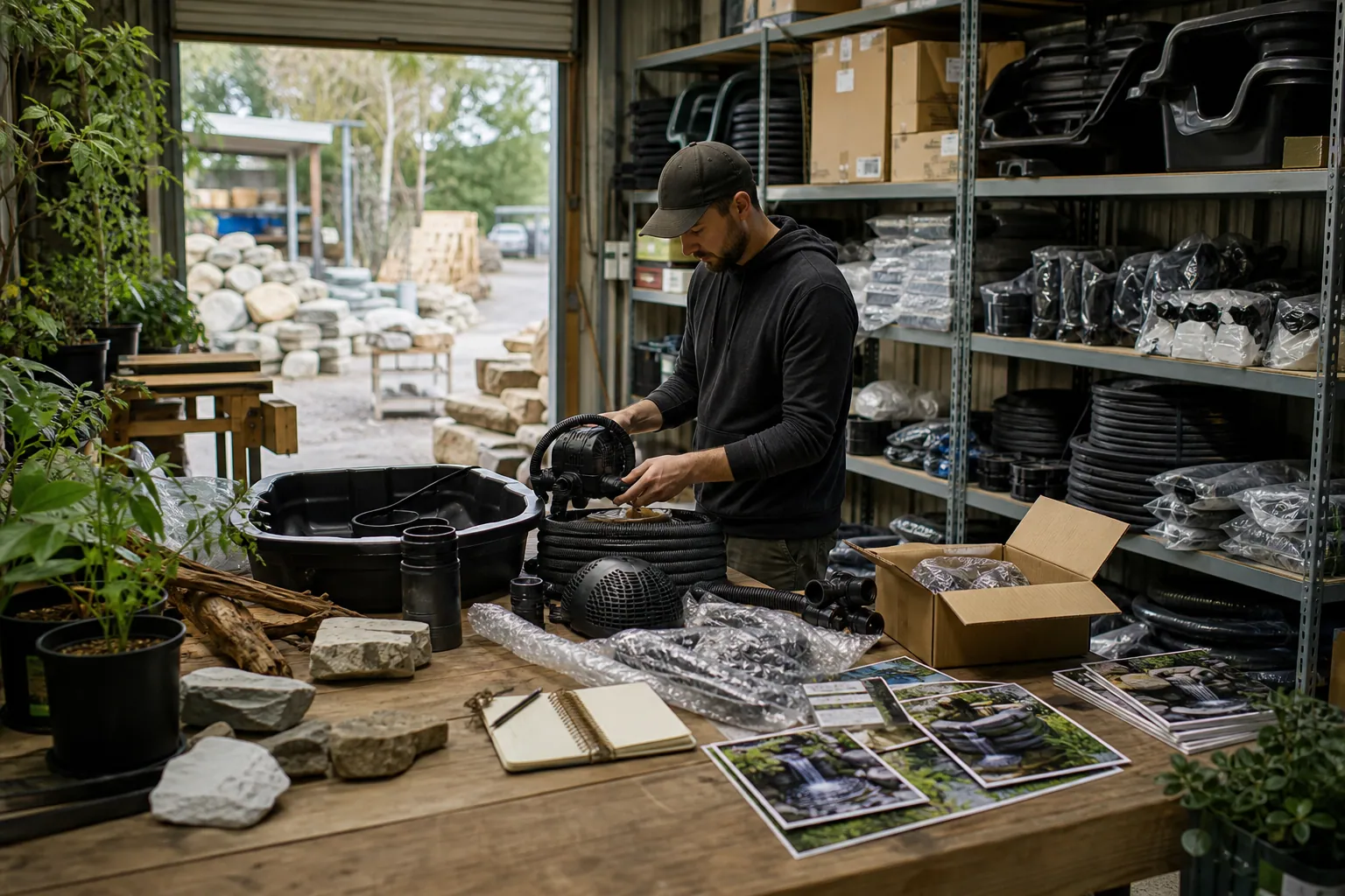
Case Study: How a Pond Kit Shop Turned Waterfall Saves Into Kit Orders
A composite Pinterest teardown of a backyard pond retailer that replaced pretty-waterfall traffic with sizing, planning, and kit-selection content that produced stronger carts.

Case Study: Which Pinterest Pins Sold Custom Address Stamps—Wedding, Moving, or Gift Guides?
A composite case study of a custom address-stamp shop comparing product Pins, wedding content, moving guides, and gift pages to find a profitable Pinterest mix.

Case Study Memo: How a Fence Contractor Turned Pinterest Saves Into Better Estimate Requests
A composite case study of a residential fence company that replaced generic backyard inspiration Pins with planning content designed to produce local, estimate-ready leads.

Case Study: How a Garage Floor Coating Contractor Turned Pinterest Saves Into Site Visits
A composite teardown of a garage floor coating company that traded broad inspiration Pins for planning content, local pages, and more estimate-ready Pinterest traffic.

Case Study: A Cottage Food Course’s Pinterest Shift From Recipe Saves to Enrollments
A composite teardown of a cottage food educator who replaced recipe-heavy Pins with compliance, pricing, and preorder content that produced more course-ready leads.

Pinterest Pin Descriptions for Personalized Notepad Shops: 4 Angles Compared
Compare four Pinterest description angles for personalized notepad shops, match each to a landing page, and test for clicks and gift-season orders.